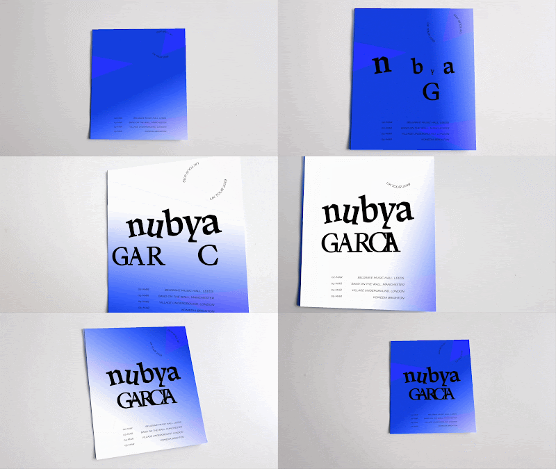
I began creating developing a simple gif for my chosen event, which was in this case a UK tour for the jazz group Nubya Garcia. Using a strong use of typography, I emphasised the main title of the event. This has been done to attract the audience to what the actual event was then after this they can have a closer look at the even information. A continuous gradient travels around the design, highlighting it quite boldly so that when the type animation has been complete, there is still something happening on the design to intrigue the audience. Also, a small piece of type spins round in a circle at the top to aid this idea. All the information included is completely necessary to the event and has been carefully set to make sure the design is still legible, even during the colour change.
Then, using the software on Artivive, I managed to link the animation up with a non moving image meaning that when I printed it out it would animate through the app. Here is a few examples of it being animated through the app. It has worked perfectly with the printed out version of the flyer and there is no delay between the app and physical print. I am happy with how this has turned out so far as I have clearly managed to link both print and digital design within a multi format system.
After some feedback on my design, I was made aware that I still had a decent amount of time left to develop this idea into something larger by making a few alterations of this or perhaps doing more branding for this band. I will review my options and see if I can push either the printed version of digital to its full potential.


No comments:
Post a Comment